The prompt
Build the product page for a high-end mechanical keyboard — a single scrolling page whose centerpiece
is a real-time 3D model of the board that assembles, explodes, and is annotated as the visitor scrolls, and
that responds when the visitor types.

Context you should know: this is going into a video watched by a large audience, your page is shown on camera
against two other frontier models, and your work will be credited to you by name. Every model gets this
identical prompt, including the same product. What's being judged is taste, motion choreography, and craft.

The product: a premium 75% mechanical keyboard. You name it, position it, and write its copy. Invent the
brand. The components you must model and be able to separate are the case (top and bottom), the weight, the
plate, the PCB, the sound-damping foam, the stabilizers, the switches, and the keycaps.

Requirements:

1. **A real-time 3D keyboard, built in code.** No imported model files, no hotlinked assets — the geometry is
   authored procedurally or in code. It needs to read as a real board: correct key spacing and row profiles,
   sculpted keycaps with proper top surfaces, legible legends, an anodized or PVD case with believable edge
   chamfers, and metal that responds to light differently from the plastic next to it. Physically-based
   materials, real lighting, an environment the case has something to reflect.

2. **Scroll drives everything.** The page is one continuous choreographed sequence — the board rotates, the
   case opens, the stack separates into its layers, individual components isolate, and everything reassembles,
   all bound to scroll position. Scrubbing backward runs it cleanly in reverse. The motion is authored and
   eased, not linear and mechanical. Getting the *timing* right is most of the grade here.

3. **A single switch, isolated and cut away.** Somewhere in the sequence, one switch separates from the board
   and opens up — housing, stem, spring, contact leaf — and actuates on a loop so the travel is visible. This
   is the detail that separates a real understanding of the product from a pretty render.

4. **It has to respond to typing.** The visitor types on their own physical keyboard and the corresponding 3D
   keycaps depress and rebound with real weight and real travel distance. Key-up cannot be the mirror of
   key-down — a switch rebounds faster than it depresses. Handle held keys, fast repeats, and multiple keys at
   once without the animation desyncing or queueing.

5. **A wireframe-to-solid transition** somewhere in the sequence, where the board reads as engineering drawing
   and resolves into the finished object.

6. **Hotspot callouts on the exploded components.** As each layer separates, a labeled annotation appears
   anchored to it with a line of copy explaining what it does and why it matters to how the board sounds or
   feels. They enter and leave with the choreography rather than popping.

7. **A complete page, not just the 3D showcase.** A hero, the scroll sequence, a technical specification table
   (layout, switch type and actuation force, mount style, case material, plate material, keycap profile and
   material, connectivity, polling rate), a section on materials and finishing, a section on sound with some
   visual treatment of the typing acoustics, and a purchase call to action with price and configuration
   options. The writing matters — this should read like a brand with a point of view, not placeholder copy.

8. **Typography and layout carry the brand.** Deliberate type scale, real hierarchy, generous and confident
   spacing. This is an enthusiast object sold on craft; the page should feel like one. Avoid the default AI
   website look — the centered hero, the three feature cards, the gradient blob, the same three fonts. Avoid
   the default mechanical-keyboard-site look too: pure black background and RGB underglow is the cliché of
   this exact category, and a large audience has seen it hundreds of times.

9. **Sixty frames per second while scrolling**, on a normal laptop, with the full board and all keycaps on
   screen. A 3D scroll page that stutters is worse than one that doesn't exist. Profile it and fix it.

10. **Responsive.** It has to work and stay beautiful down to a phone. The scroll choreography adapts rather
    than breaking, and the typing interaction degrades gracefully where there's no physical keyboard.

11. **Single self-contained `index.html`.** Any library via CDN — three.js, GSAP, Lenis, whatever you want. No
    build step, no server, no API keys, no hotlinked images or fonts (use system or CDN-loaded webfonts, and
    generate any imagery in code). You have free reign to look up what libraries exist and how to use them.

12. **QA it by using it.** Scroll the whole page top to bottom and back up several times at different speeds.
    Type on it — single keys, held keys, fast bursts, chords. Confirm the sequence scrubs cleanly in both
    directions, nothing desyncs or jumps, callouts anchor to the right parts, the switch cutaway actuates
    correctly, the frame rate holds, and the mobile layout is genuinely good rather than merely functional.
Fix what breaks.The exact prompt from the published test.
The builds
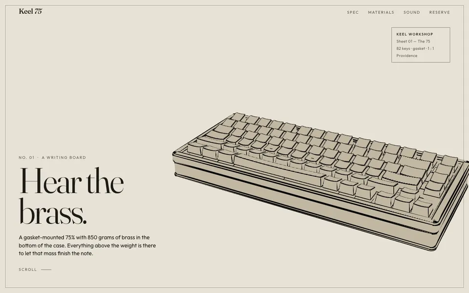
Grok 4.7 · Screenshot of the buildRuns in your browser
Featured in
Grok 4.7: No-Hype Full Review & Testing
This build’s chapter starts at 12:03.

Written by
Pat Simmons. Pat tests AI models and tools on the AI for Mortals YouTube channel.