We Added One GitHub Link to Our Claude Prompts. The Reports Got Easier to Read.
Grenade is a free page of rules that tells Claude how to build artifacts people get at a glance. We tested it on a decision memo, a weekly update and a project tracker, then used it to fix a messy report. Here are the before-and-after pages, what held up and the prompts to copy.
 AI for Mortals Staff
On this page
Claude artifacts are now how a lot of work updates get made. You paste in your notes, ask for a page, and send whatever comes back to your boss or your team.
The trouble is what comes back. It's often a long scroll of boxes and bullets that makes the reader do the sorting.
Grenade is a free page of rules on GitHub that tries to fix that with one extra line in your prompt. We ran it on three sets of real-looking work notes and on one messy report, side by side with the same prompts without it. Here's what changed, where it slipped and the prompts to use.
Why AI-made reports are so hard to read
You've probably had one land in your inbox. A coworker who used to send two-line emails now sends a 600-word update, with six headings and a summary of the summary.
That complaint is everywhere right now. In one of the most upvoted threads on the subject, office workers describe colleagues firing off long AI emails that suggest things "the team" should do and leave everyone else to work out what's being asked. Another big thread says workers are drowning in "workslop" while bosses talk up the productivity gains.
The usual Claude artifact has the same problem in a nicer layout. The facts are all there, but the reader has to dig for the one thing they need to do.
What Grenade is (and the one line you add)
Grenade is a single page of rules, free under an MIT license. You never have to open it.
You add one line to the end of your prompt, and Claude reads the page and follows it:
Follow github.com/rubenhassid1/grenade
The rules start with the reader. Who are they, what do they already know, and what should they do after reading: decide, catch up, keep checking, learn, say yes, use a tool or keep a cheat sheet?
That job picks the layout. A decision gets the ask and the deadline on top with each option as a card. A weekly update gets three or four numbers that matter, each compared to last time. A tracker gets number tiles and colored status pills.
Then come the hard limits. No paragraph longer than two lines, at most four sections below the first screen, at most one table, and every change says what it's compared to ("+$6,700 vs last week", never just "+16%"). It also asks for a short header line saying what the page is, who it's from and who it's for, so a forwarded page still makes sense.
The pages come out in Claude's own look: the serif headings, the warm clay accent, green and red only for good and bad.
How we tested it
We wrote three sets of notes for a made-up 14-person design studio, the messy kind you jot down between meetings:
- A decision memo asking a partner to approve a $2,030-a-year tool for client approvals, with three options and a deadline.
- A weekly update for the two partners: revenue, billed hours, overdue invoices, a freelancer overspend and three decisions.
- A project tracker the whole team checks on Monday mornings: seven client projects with leads, budgets and due dates.
Each set went to Claude Opus 5.5 twice, in a fresh folder in Claude Code, with the same prompt. The only difference was the Grenade line at the end of the second one. Here's the tracker prompt, for example:
Make an HTML page about our client projects for the whole studio team, who check it every Monday morning. My notes are in notes.md. Save the page as page.html.

Follow github.com/rubenhassid1/grenade
Then we took the plain tracker Claude had made and asked it to fix that, with Grenade's fix prompt. We screenshotted every page at desktop and phone width and counted the words.
Claude artifact examples: before and after
The plain prompt made decent pages. They were tidy, with the numbers in boxes, and nothing was wrong with the layout at a glance.
The Grenade pages were shorter and led with the point. Every one of them opened with a header line naming who it's from and who it's for, then a title that says the news instead of naming the document.
Word counts, plain prompt first, then with Grenade:
| Page | Words | Length |
|---|---|---|
| Memo | 450 → 332 | 28% shorter |
| Update | 274 → 257 | 20% shorter |
| Tracker | 436 → 305 | 17% shorter |
| Fix | 436 → 258 | 21% shorter |
The weekly update barely lost any words, because the plain version was already lean. What changed there was the order: the decisions moved up and each number got a comparison.
The decision memo

Without Grenade, the title was "Client approval software: recommend Filestage." With it, the title gave the reason: Filestage handles both design proofs and video, and clients can comment without making an account.
The Grenade version put the cost and the ask in one box at the top ("Reply to Sam by 7 Nov"), and laid the three options out as cards with the pick marked.
It also caught something we hadn't spelled out. Setup takes about a week, and our deadline left only five days before the project it was meant for, so it listed that under "3 things that could go wrong."
The plain version did one thing better. It laid out the two ways to pay (a year up front, or three months first so you can cancel) as a side-by-side choice with the cost of each. The Grenade version made the yearly plan the ask and pushed the three-month option down into the risks list.
The weekly update

The plain title was "Week of October 27," which tells a partner nothing they don't already know.
The Grenade title was "October beat its revenue target, but overdue invoices and freelancer costs need your decisions." Read that and you know whether to open the page now or after lunch.
It cut the top numbers from six to four and tagged each one with what it's compared to. The freelancer overspend became a small bar chart inside the "hire a second editor" decision, which is where a partner needs it.
The project tracker

The plain tracker showed the same overdue items up to four times: in a "needs attention" list, a calendar, the main table and a "waiting on clients" list.
The Grenade tracker showed each one once. The top box named the three client answers to chase this week, then one table held all seven projects with a status pill each.
How to fix a Claude artifact someone sent you
This is the part we'd use most. You don't need to have made the page yourself.
Drop the page into a Claude chat (the file, the link or a screenshot) and add:
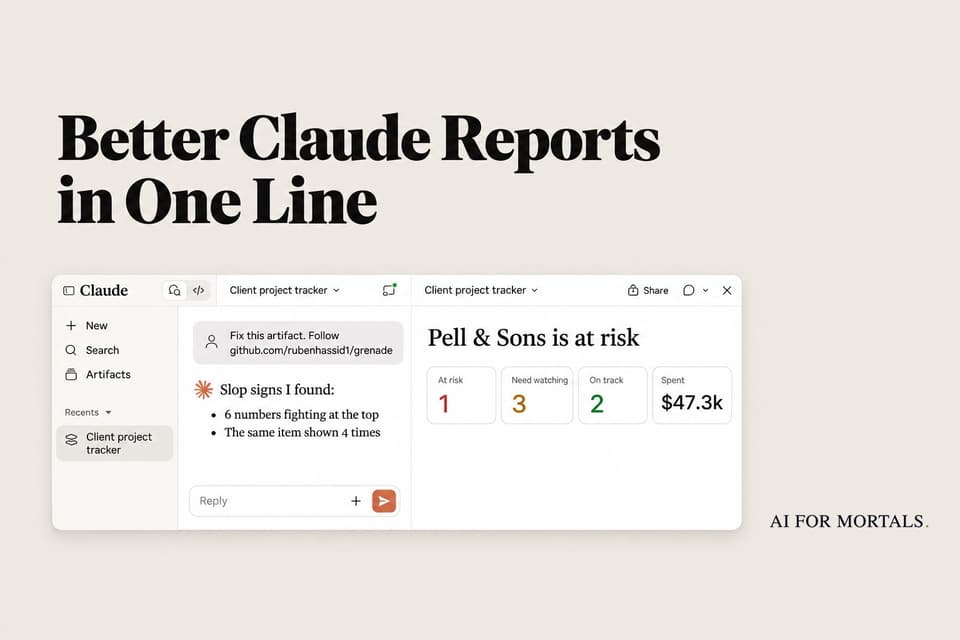
Fix this artifact. Follow github.com/rubenhassid1/grenade
We gave it the plain tracker from above. Claude listed what was wrong before rebuilding anything: no line saying who the page was for, six numbers fighting at the top, the same items repeated up to four times, seven sections and lists of six items.

The rebuild went from 436 words to 258. It kept every budget figure, and the totals still added up ($47,300 spent of $158,000).
It also gave the team a "Today" line at the top: who chases which client, and what to check. On a page the whole team opens on Monday morning, that's the line that gets read.

What still needs your eye
Grenade made every page easier to scan, but it didn't make them perfect. Three things to check before you send.
Check every date and weekday. Our own notes had a slip: they called November 3 a Monday when it was a Tuesday. The plain pages and the fixed tracker built their weekday labels from that, so they showed "Kickoff Wed Nov 12" when November 12 is a Thursday. The Grenade decision page got the weekdays right, but don't count on it.
Check every date and weekday on this page against the real calendar for 2026. List any that don't match, then fix them.
Watch for options that get folded away. Grenade likes one clear ask, so a choice you wanted the reader to make can shrink into a footnote, the way our three-month trial did. If the choice matters, say so.
Put the two payment options back near the top as side-by-side cards, each with its first-year cost, and ask Priya to pick one.
It doesn't always follow its own limits. The rules aim for 50 to 120 words on the first screen, and our Grenade pages ran 155 to 223. Small grey captions under the numbers also crept back in, which the rules ban. Claude flagged the word count itself on the fix, which helped.
It's also slower. The plain pages took 43 to 65 seconds each, and the Grenade ones took two to three minutes, because Claude reads the rules and then checks its own layout.
How to use Claude artifacts with Grenade
You don't install anything to use it in the Claude app. Claude opens the link and reads the page, so web search needs to be on in that chat. We ran our tests in Claude Code, which fetches the page the same way.
Attach your notes, a spreadsheet or a doc, then use this shape:
Make an HTML page about [WHAT IT'S ABOUT] for [WHO WILL READ IT, AND THEIR ROLE]. My notes are attached.

Follow github.com/rubenhassid1/grenade
Two parts of that prompt matter. "HTML page" stops Claude from writing a plain doc that reads like a long message. And the reader's role changes the page: "for Dana, my CFO" gets cost up front, while "for Dana, my teammate" gets the tasks.
If the request doesn't say who's reading, Claude may ask you two or three quick questions first. Answer them; that's where the better page comes from.
If you use Claude Code, the same rules ship as a plugin called noslop, so you don't have to paste the line every time:
/plugin marketplace add rubenhassid1/grenade
/plugin install noslop@noslop
The rules also have a "web version" that builds a small website, puts the code in a private GitHub folder and hosts it on Vercel behind a passcode. That needs free GitHub and Vercel accounts and Claude Code, so it's a bigger job than one prompt in the app.
Four more free tools that clean up AI-made pages
Grenade fixes what's on the page. If you build pages in Claude Code and want them to look less AI-made, these free, open-source projects come up next. We picked them because each one does one clear job and works inside Claude Code. We haven't run them through the same test.
- Impeccable scans a page for the design habits that mark it as AI-made and suggests fixes. It's one of the most popular design add-ons for coding agents, with over 100,000 stars on GitHub.
- unslop is a Claude skill that turns a generic, AI-looking layout into something that looks designed. A few of Grenade's own rules borrow from it.
- Emil Kowalski's skills teach Claude motion and polish: buttons that react when pressed, and dark mode that fades in.
- Magic UI is a library of animated pieces, like numbers that count up when a page opens. It's for the website version, which Claude Code builds as a small app.
When we tested whether long Claude prompts are worth it, most of the extra lines changed nothing, but saying the format and the audience still mattered. Those are the two things the Grenade prompt makes you name.
And if what bugs you is the writing more than the layout, you can teach Claude your writing style from your own edits. Claude's Docs, Slides and Design are also free now, if you'd rather start from one of those.
All our runs used Opus 5.5. Pat's full review covers what it's good and bad at:
Sources
- Grenade: the rules page and examples (GitHub)
- Grenade example pages (GitHub Pages)
- What are artifacts and how do I use them? (Claude Help Center)
- Claude Code plugins (Claude Code docs)
- Impeccable (GitHub)
- unslop (GitHub)
- Shopify CEO says employees' "slop grenades" are making more work for everyone else (r/technology)
- Workers say they're drowning in "workslop" (r/technology)


Comments
Sign in to join the conversation.