I Made GPT-6 Astra and Fable 5.1 Build the Same App
Three prompts, two models, six builds. Every prompt, every live build, and what each one actually cost.

I picked three jobs that are hard in different ways. One is a known object anybody can check by eye. One is real ground, where being wrong means teaching someone something false. One is a game, which is the thing everybody claims these models can now make.
Every prompt is below in full and copyable, every build is the real deployment, and the cost figures at the bottom are what each one actually consumed.
What I tested
Each model got the identical prompt, byte for byte, with no steering, no follow-up and no second attempt, and I did not touch the code. I wrote every spec myself so the builds are directly comparable rather than each model picking something it happened to be good at. The iPod is a native macOS app rather than a website, so it has no live link. Both versions are downloadable instead.
Test 1: A 3D iPod that plays music it wrote itself
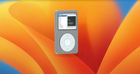
A native Mac app: model an iPod Classic in Blender, make the click wheel browse your real Codex threads, and generate its own songs that sound like the early 2000s. Neither model was told how to prompt for the music, or given a single artist to imitate. Because it's a Mac app rather than a website there's no live link, both versions are downloadable from github.com/per-simmons/codex-ipod. They're unsigned, so the first launch needs approving once under System Settings › Privacy & Security.
Build a native macOS application called Codex iPod: a photoreal 3D iPod Classic floating on the desktop, whose screen is a working browser for my real Codex threads, driven by the click wheel, that also plays music.

Context you should know: this is going into a video watched by a large audience, your build will be shown on camera next to another frontier model's version of the same app, and your work will be credited to you by name. Everyone watching knows what an iPod looks like. Go all out.

You are running headless. Do not ask me any questions, do not stop for approval, and do not wait for input at any point. Make every decision yourself and finish the whole thing in one pass.

### Deliverable

A buildable Xcode/SwiftPM project at `./CodexIPod`, plus a built, launchable `.app`. Swift 6.2, SwiftUI + SceneKit (or RealityKit/Metal if you prefer), macOS 26 target, Apple Silicon. No external Swift packages. It must build from a clean checkout with a single command, documented in `RUN.md`.

### The 3D iPod — authored in Blender

Write a Python script at `blender/ipod.py` and run it headless with `/opt/homebrew/bin/blender --background --python blender/ipod.py`. That script procedurally models the iPod and exports `CodexIPod/Resources/ipod.usdz` and `.glb`. Do not download a model, do not use a store asset, and do not fake it with rounded cubes in Swift. The mesh comes out of Blender or this build has failed.

Model an **iPod Classic 6th generation, silver**, at real dimensions: 103.5 mm tall × 61.8 mm wide × 10.5 mm deep.

**The proportions are the whole thing.** Get these exactly, because they are what the eye checks first:

- The **click wheel is 43 mm in diameter**, horizontally centered, and the **center button is 17.5 mm**. A wheel that is too small or too large reads as a toy instantly.
- The **screen is 2.5 inches diagonal at 4:3**, roughly 51 × 38 mm of visible glass, horizontally centered, sitting in the upper portion of the face with **equal margins left and right**. The gap between the bottom of the screen and the top of the wheel is **larger** than the gap between the bottom of the wheel and the bottom edge of the device.
- In plan view the **corner radius is about 7 mm** — generous. But the **edge chamfer where the face rolls into the side is under 0.5 mm** — tiny. Getting that ratio backwards is the single most common way this ends up looking like a generic rounded rectangle instead of an iPod.

**Construction, not just shape:**

- Two shells: an **anodized aluminum front face** in silver with a fine bead-blast micro-texture, and a **polished stainless steel back** that is a shallow continuous curve, not a flat plate. They meet at a **hairline seam that runs the entire perimeter**, with a thin polished chamfer along it. That seam is a major part of why the real object reads as a machined product.
- The steel back gets **anisotropic reflection** with a directional grain, plus a subtle roughness variation for micro-scratches and fingerprints. A perfect chrome mirror is wrong and looks CG immediately.
- The **screen sits behind a glass plane that is flush with the face**, with a **black bezel surround visible under the glass** framing the active area. The screen is not printed onto the aluminum.
- The **click wheel is recessed slightly below the face**, matte light-grey plastic, and the **center button is set into it with a visible circular gap** and a **concave** top face. Not flush, not proud, not a floating disc.
- `MENU` at 12 o'clock, rewind at 9, fast-forward at 3, play/pause at 6, as **subtly printed light-grey glyphs with a hint of translucency** — printed on, never raised geometry.
- A hold switch and headphone jack on the top edge, a 30-pin dock connector on the bottom edge, both modeled.
- Chamfer every hard edge on the whole model. Nothing anywhere is a razor corner.

**Lighting and rendering:** a large soft key from upper-left, a fill from the right, a rim behind to separate the metal from the background, and a soft contact shadow anchoring it. PBR values: aluminum around 0.35 roughness, steel around 0.08, wheel plastic around 0.6. The screen emits, but a **specular highlight passes over the glass above it** so it reads as being behind glass rather than glowing out of a hole.

**Fail conditions — if any of these are true when you look at your own render, go back and fix the model:** it reads as a rounded rectangle with a circle stuck on it; the steel back is flat grey instead of carrying a gradient reflection; the screen looks painted on; the wheel looks like a decal; the corners look sharp; the whole thing looks like a phone.

**Self-check you must actually run:** render a straight-on orthographic front view, measure the wheel diameter, the screen width and the body width in pixels, and confirm the ratios match the millimetre figures above. Write the measured numbers into `BUILD_NOTES.md`. If they are off, fix the model and re-measure.

### The window

No window chrome. Transparent, borderless, no titlebar, no traffic lights — just the floating iPod and its contact shadow over the desktop. Movable by dragging the device body. The menu bar carries the app name **Codex iPod** and one menu, **View**.

At rest the iPod sits at a slight three-quarter angle. Left-click-dragging the background orbits it around its vertical axis and it settles back to a front-facing rest pose with an ease-out on release. Mouse movement near it produces a few degrees of parallax tilt. The screen renders live onto the screen geometry as a texture — part of the 3D scene, not a 2D overlay pasted on top — and stays correctly mapped as the device rotates.

### The data

Read my real threads from `<local-path-redacted>` — nested by year/month/day, roughly 1,500 files. `<local-path-redacted>` may help. Each file is one thread of JSONL events. Derive per thread: a title (the first user message trimmed to one line), a timestamp, the ordered messages with roles, and any file paths mentioned. Sort newest first. Parse defensively — malformed or empty files get skipped silently, never crash. Never write to, move, or modify anything under `<local-path-redacted>`.

### The music

An iPod that cannot play music is a prop. Generate the library yourself.

Generate the library yourself with the **ElevenLabs Music API**. Your key is in the `ELEVENLABS_API_KEY` environment variable in this directory's `.env`. Go read their documentation, work out how to call it properly, and figure out how to prompt it well — getting good output out of a music model is part of this task, and I am not going to hand you the prompts.

What I want: **five original tracks that sound like they came off an iPod in the early 2000s.** That era's textures — think the guitar tones, the drum sounds, the production style of roughly 2001 to 2006. Iterate on your prompting until the output actually sounds like the period rather than like generic stock music, and listen to what comes back before you accept it.

**Budget — this is a hard limit.** The key has a finite, shared credit balance and another model is drawing on the same pool, so you do not get to burn it all. Generate **no more than 10 minutes of audio in total, including every failed attempt and retry.** Keep tracks to 60–90 seconds each — an iPod demo does not need full-length songs. Check what you have spent as you go, and stop generating when you hit the limit even if you are not happy with the results; ship what you have and say so in `BUILD_NOTES.md`.

**Original compositions only — do not name, imitate, or reference any real artist, band or song, in your prompts or in the output.** Write the exact prompts you ended up using into `BUILD_NOTES.md`, along with what you tried first and why you changed it. Save the audio into the app bundle so it plays offline, and generate simple square cover art for each track.

Then wire the music in properly: a **Music** item on the main menu, an album/track list, and a **Now Playing** screen with the cover art, track title, a progress bar with elapsed and remaining time, and working transport. The wheel scrubs the playhead on Now Playing and changes volume on a second press, exactly like the real thing. Play/pause, next and previous work from the wheel. If the API call fails, ship the app with a clearly-labelled empty library rather than silent placeholder tones, and say so in `BUILD_NOTES.md`.

### The screen — exact spec

320 × 240 logical pixels, rendered crisp, correct 4:3 aspect. Chicago-style bitmap-feel typography, black on white, blue-grey gradient title bar. Every screen shares that title bar: the screen name on the left, a small play glyph and a battery icon on the right.

**1 — Main menu.** Split view: menu list on the left half, and on the right a square album-art panel showing a generated CODEX graphic — a terminal prompt glyph over a dark gradient, the wordmark CODEX, and a small subtitle line beneath. Items in this order: Threads, Music, Projects, Pinned, Recent, Search, Settings, Shuffle Tasks, Now Reading. The selected row is a solid blue gradient bar, white text, chevron at the right edge.

**2 — Threads list.** Full width, nine rows visible, each row the thread title with a chevron, ellipsized cleanly. Same blue gradient selection. A footer strip reads `Center: read · Play: open in Codex` on the left and the position as `36 of 994` on the right.

**3 — Thread reader.** Title bar carries the thread title. Beneath it a sub-header with the current message's role on the left (`You` / `Codex`) and its position on the right as `1 / 22`. Body is the wrapped, scrollable message text with a thin scrollbar when it overflows. Footer reads `Wheel: scroll · ◀ ▶: message` on the left and the scroll position on the right.

**4 — Now Playing.** As described above.

**5 — Settings.** Brightness, Clicker, Sync Now, About. Brightness and Clicker toggle in place with the center button and show their current value at the right of the row.

Every other main-menu item goes somewhere real — a working screen or an honest empty state. No dead ends, no lorem text.

### The controls

The click wheel is the primary input and it works **by angle, not by drag distance**. Dragging in a circle anywhere on the ring accumulates rotation; roughly every 20 degrees advances the selection by one row in the direction of travel, accelerating if the user keeps spinning. Center selects and pushes. MENU pops back up the hierarchy and restores the previous selection on the screen you return to. Play/pause opens the highlighted thread in Codex. Rewind and fast-forward step between messages in the reader.

Transitions are the classic iPod OS horizontal slide — push left, pop right, about 250 ms, ease-in-out. A mouse or trackpad scroll also drives selection. Everything is reachable from the keyboard too: arrows, return, escape.

### Acceptance criteria — verify each yourself before you finish

1. `blender/ipod.py` runs headless without error and produces `ipod.usdz`. Delete the export and re-run it to prove it regenerates.
2. The orthographic proportion check above passes, with the measured numbers written down.
3. The app builds clean and launches with no window chrome visible.
4. The threads list is populated from the real `<local-path-redacted>` data and the footer count matches the number of threads actually parsed.
5. Opening a thread shows real text from that file and the stepper reaches the last message.
6. A generated track plays end to end, and the wheel scrubs it.
7. Circular dragging moves the selection both directions, and MENU returns up the stack with the previous selection intact.
8. The screen texture stays correctly mapped while the device rotates.
9. Screenshot the main menu, the threads list, the reader and Now Playing into `qa/`, plus a three-quarter render of the device itself. Look at them. If the type is blurry, the metal reads flat, the proportions look off, or the screen is misaligned on the mesh, fix it and shoot again.

Write `BUILD_NOTES.md` covering the measured proportions, the material and lighting values you chose, the music prompts you used, how the wheel gesture math works, and anything you could not get to.
Test 2: The D-Day landing, rebuilt in 3D
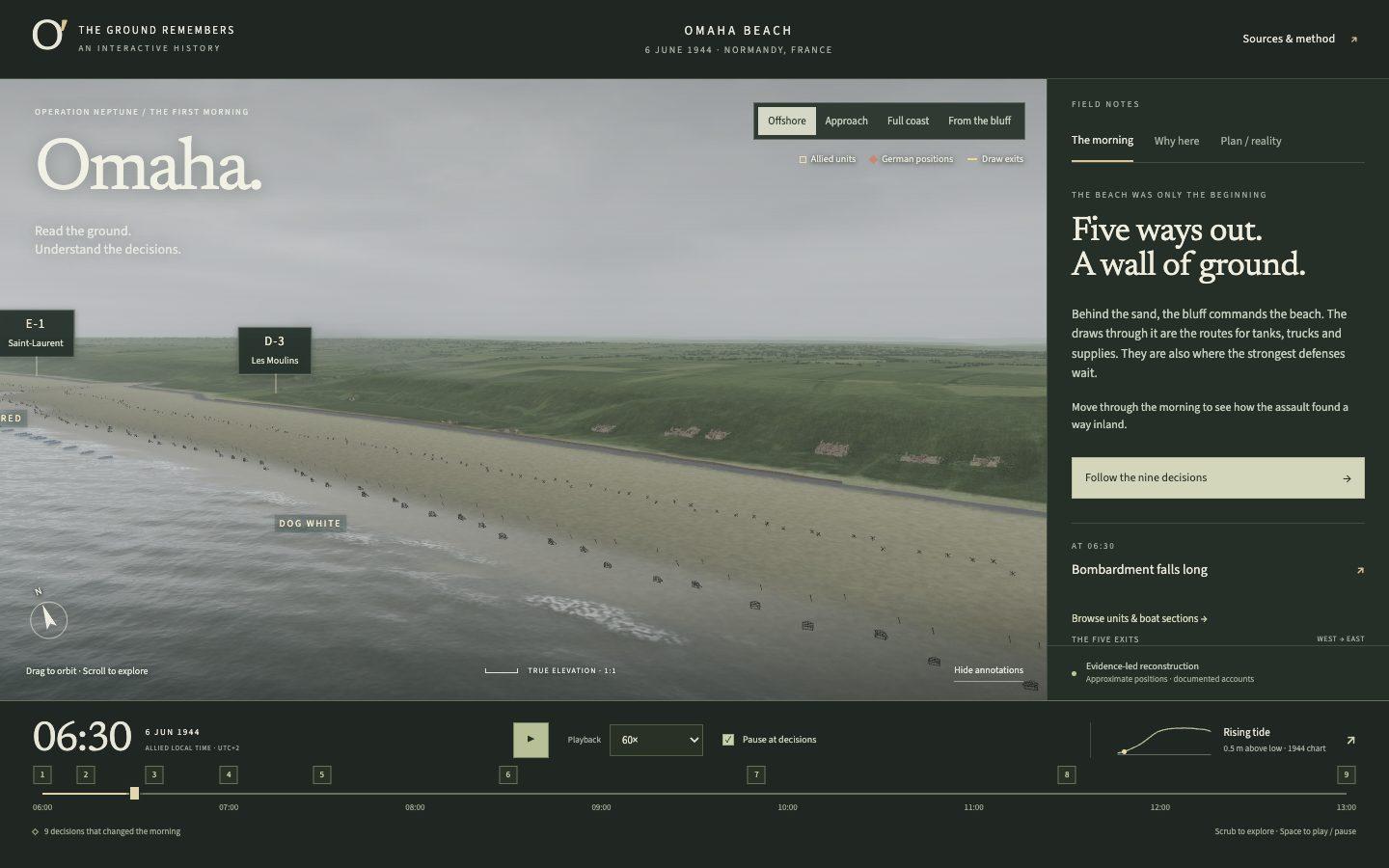
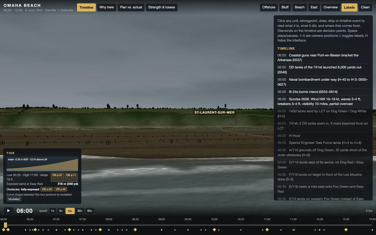
Eight kilometres of real coastline from elevation data, the whole morning on a timeline you can scrub, the tide coming in as it actually did, and every claim on screen carrying a source. Inventing a single number was a fail condition.
Build an interactive 3D reconstruction of **Omaha Beach on D-Day — 06:00 to 13:00, June 6th 1944** — for a student who wants to understand not just what happened but why it happened that way. It runs in the browser, and it has to be good enough that someone learns the battle from it.

You are running headless. Do not ask me any questions, do not stop for approval, and do not wait for input. Make every decision yourself and finish the whole thing in one pass. Bring your own headless browser (Playwright or Puppeteer) for testing.

### Deliverable

A single deployable web app in `./omaha`, built with Three.js. It must run from a static build with no server-side dependency, and it must hold 60fps on an M-series Mac at 1920×1080. Document the build and run commands in `RUN.md`.

### The terrain — this is the part I will judge hardest

Reconstruct the ~8 km of coast from Vierville-sur-Mer in the west to Colleville-sur-Mer in the east, from 1 km offshore to 1 km inland. Build it from real elevation data, not from imagination — source a DEM for the Calvados coast and drape it. The single most important feature is the **bluff**: a 30–45 m rise running the length of the beach, cut by five draws — **D-1 Vierville, D-3 Les Moulins, E-1 Saint-Laurent, E-3 Colleville, F-1** — which were the only vehicle exits off the sand and therefore the entire objective of the morning. Label the beach sectors too, west to east: Charlie, Dog Green, Dog White, Dog Red, Easy Green, Easy Red, Fox Green, Fox Red. A student needs those names to understand that the waves came ashore well east of where they were meant to. If your terrain does not make it visually obvious why an army had to take those five gaps, the build has failed at its main job.

The terrain must carry, in the right places: the shingle bank, the seawall along the western half, the tidal flat, the beach obstacles (Belgian gates, hedgehogs, stakes) in the band where they actually sat, the German strongpoints (the WN-numbered positions) sited on the bluff with their real fields of fire, and the draw exits. Ground textures should read as sand, shingle, marram grass and cultivated field, not as one tiled noise.

**The tide is a mechanic, not decoration.** Model the real tidal curve for that morning. At H-Hour the water is low and the obstacle belt is exposed with several hundred metres of open sand to cross; by mid-morning the water has risen over the obstacles and the beach has narrowed. The water level must move with the timeline, and the app must let the student see that the tide is what changed the problem.

Light it for early morning under overcast — low sun, soft directional light, haze offshore, no warm golden-hour treatment. Smoke from the grass fires on the bluff should build across the morning, since it genuinely changed what the naval gunners could see.

### How it has to look

It has to look real. Not stylized, not a diagram with some 3D on it — like footage. Everyone watching this has the opening of Saving Private Ryan in their head, and that is the bar: cold overcast light, smoke and haze thickening down the beach through the morning, sand and water that read as sand and water.

Work out how to get there yourself, and use whatever assets, techniques and libraries get you closest — you do not have to model everything from scratch.

What it cannot be: men who read as capsules, blobs or untextured shapes; flat-shaded ground; a scene that looks lit by default lighting. If you cannot make something hold up at a given camera distance, do not put the camera there.

### The timeline — 06:00 to 13:00, minute resolution

A scrubbable timeline is the primary control: play, pause, scrub, and a speed control from real-time up to 60× . As it runs, the units move on the terrain and the state of the battle changes with it.

Represent, as they actually moved: the assault waves by boat section, the DD tanks (including the ones launched too far out), the engineer demolition teams working the obstacle belt against the rising tide, the German defensive positions and their arcs, the destroyers that closed to point-blank range late in the morning, and the small ad-hoc groups that got up the bluff between the draws rather than through them. Units are legible markers with unit identifiers — not toy soldiers, and not featureless dots.

Every unit and event on the timeline must be clickable, and clicking it explains itself.

### The teaching layer — the actual point of this

A student should come away understanding the *decisions*, not just the sequence. Build in:

- **Six to nine decision points** on the timeline, each of which stops and explains: what the commander knew at that moment, what options were on the table, what was chosen, and what it cost. The bombardment falling long, the DD tanks being launched into the sea state, the current pushing the landing east of the marked sectors, the shift from taking the draws to climbing between them, the destroyers coming in close, and the exits finally opening.
- A **"why here" mode** that overlays the terrain reasoning: the fields of fire from the strongpoints, the dead ground, the draws as the only vehicle exits, and the reason a plan built on the bombardment working fell apart when it didn't.
- A **compare-the-plan-to-what-happened** view — the intended landing sector for each unit against the sector it actually came ashore in.
- Casualty and strength figures shown as they change through the morning, with their sourcing visible.

### Sourcing rules — non-negotiable

Every timestamped event, every unit designation, every casualty figure and every strength number must be traceable to a real source, and each one carries an inline citation the student can open. Use the US Army Center of Military History's official history, the after-action reports, and other primary documentation. Where sources disagree, say so in the app rather than picking one silently. Where you do not know something, say you do not know. **Do not invent a single number, unit, time or name.** A confident fabrication is worse than a gap, and I will check them.

Keep a `SOURCES.md` listing every source you used and what you took from each.

### Acceptance criteria — verify each of these yourself before you finish

1. It deploys and loads to an interactive state in under 5 seconds on a cold load.
2. Scrubbing the timeline moves units and the tide together, and running it at 60× holds framerate.
3. The five draws are individually identifiable on the terrain and each is labelled.
4. Every decision point opens, and every one of them cites its source.
5. Take screenshots at 06:30, 08:00, 10:00 and 13:00 from a camera position offshore, plus one from the bluff looking down at the beach, and save them to `qa/`. Look at them. If the bluff does not read as commanding ground, or the beach reads flat, fix the terrain and shoot again.
6. Look at your own screenshots and ask whether they could pass for footage. If the figures read as blobs or the beach reads flat, fix it and shoot again.
7. Pick three claims from your own timeline at random and re-verify them against your sources. Note the result in `BUILD_NOTES.md`.

Write `BUILD_NOTES.md` covering where your terrain data came from, how you built the tide model, which events you could not source and therefore left out, and anything you could not get to.
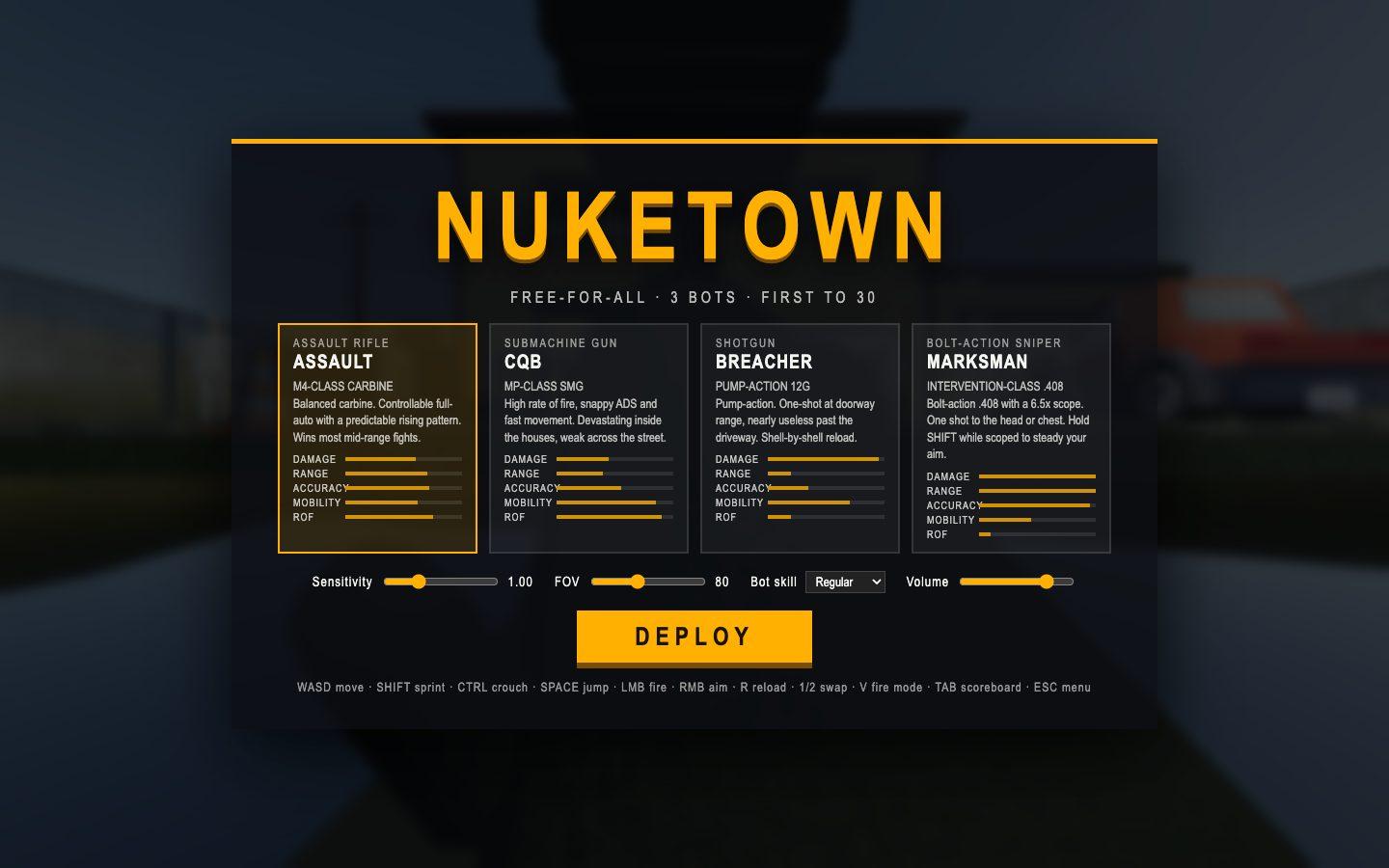
Test 3: A Call of Duty game
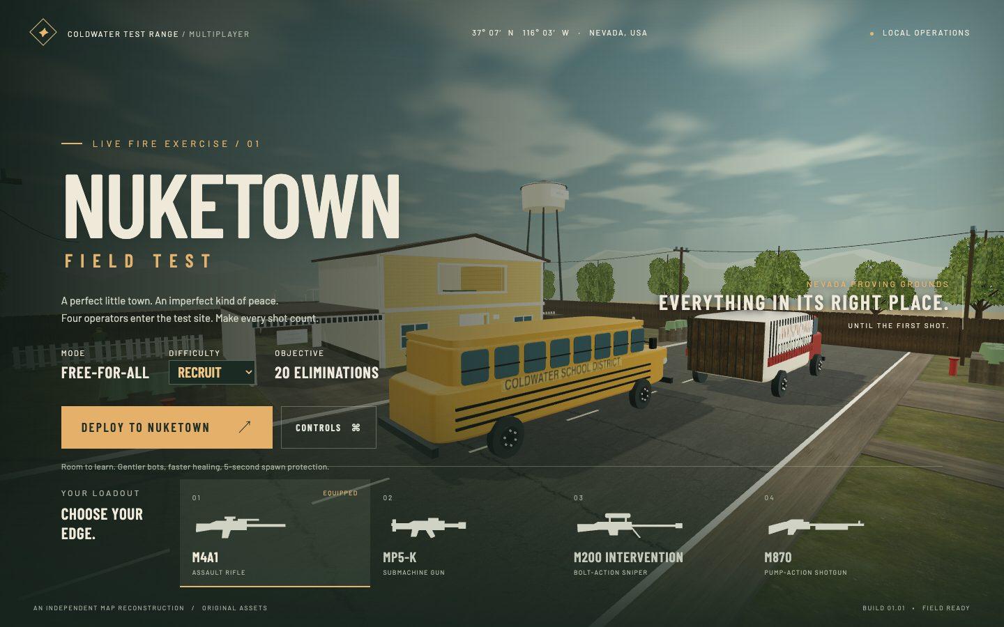
Loadouts, killstreaks, a killcam, bots that use cover, and gunplay that has to feel like the real thing. This is the only build that got follow-up passes rather than a single shot.
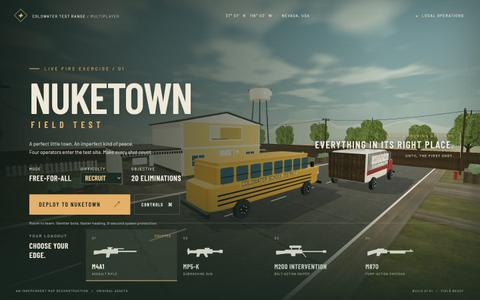
Build the best Call of Duty game you can possibly make, in the browser. Get it perfect.

**Research this thoroughly before you write a line of code.** Study how Call of Duty actually works — recoil patterns, ADS, scope optics, hit registration, hitmarkers, damage falloff, spawn logic, killfeeds, killstreaks, killcams, match flow. Then hit every one of them. If Call of Duty has it, this has it. There is no part of this you get to skip because it was hard.

### The characters — get this right or nothing else matters

Every soldier in the world is a **rigged, textured, skinned humanoid driven by real animation clips**. Idle, walk, run, strafe, crouch, reload, death — blended by actual velocity, so the legs move at the speed the body is travelling and the upper body aims independently of the legs. Feet plant on the ground. Nobody skates. When someone dies they play a death animation or ragdoll; they do not blink out.

**Do not assemble characters out of primitives.** A torso box, a sphere head and cylinder limbs reads as boxy and blobby from the first frame, and rigid limbs sliding through space is the single most obvious tell that a game is not real. Source a rigged humanoid with locomotion clips and drive it with an animation mixer. Rigged, animated, game-ready characters are freely available and fetchable without a login — find one, or several, and dress them as soldiers. You do not have to model or rig anything yourself.

They read as soldiers, not as generic figures: helmet, vest, and the weapon actually held in the hands, attached to the hand bone so it moves with the animation. Correct human scale, roughly 1.8 m. Contact shadows under everyone, so nobody floats.

### The rest of the game

**Onboarding and loadout, before the match.** A pre-match screen that sets up the operation: a tactical map overview of the battlefield, a solo-match configuration with enemy count, score limit and time limit, and a difficulty selector. A primary weapon grid with a render of each gun and its real stats — class, magazine, optic, sprint speed. A custom-loadout panel pairing a primary with a secondary and a lethal, with stat bars for damage, fire rate, range, mobility and accuracy. A control legend and an input-device toggle for mouse or trackpad.

**Gunplay is most of the grade.** Every weapon feels genuinely different to fire — recoil you can learn, weapon sway, ADS that changes accuracy, hit registration you can trust, hitmarkers and a distinct headshot cue, damage direction on the HUD. Include an Intervention-class bolt sniper with a real magnifying scope.

**The HUD.** Minimap with a facing cone, match timer, live score, health, ammo and reserve, weapon name, stance indicator, compass heading, killfeed and scoreboard.

**Killstreaks**, earned on a kill count and shown as a progress rail: UAV, precision strike, attack helicopter, stealth bomber, chopper gunner.

**A killcam.** When you die, replay the last seconds from your killer's point of view. It needs a replay recorder and a visible player body, which is another reason the characters have to be real.

**The AI.** They path the map, use cover, take angles, lead their shots, reload, and can be beaten. They do not see through walls and they do not stand still.

**Sound.** Layered gunshots — transient crack, low-end body, mechanical action, outdoor tail — rotated across samples so repeated shots do not machine-gun one waveform. Different tails per weapon. Footsteps vary by surface.

**The map.** Small, symmetric and fast, with buildings you can enter and hold, upstairs sightlines, and no geometry a player can get stuck on. Spawns placed so nobody spawns in a crosshair.

1920×1080 at a locked 60fps. Do not ship asset files taken from the real game — source CC0 / CC-BY assets or make your own, and log every license in `ASSETS.md`.

You are running headless. Do not ask me any questions, do not stop for approval, and do not wait for input. Make every decision yourself and finish it in one pass.

### Before you call it done

1. It deploys live and loads to a playable state in under 10 seconds cold.
2. A full match works end to end — every weapon fires, hits register, you take damage, die, see a killcam, respawn, and reach a result screen. A pointer-locked FPS is awkward to automate, so if you cannot drive it headlessly, drive the game logic directly and say in `BUILD_NOTES.md` how you verified it. Do not claim it works without checking.
3. It holds 60fps with all opponents active and firing. Report the frame time you measured.
4. Walk the map perimeter and every interior with a scripted path. Report any stuck geometry and what you fixed.
5. Screenshot the loadout screen, the spawn view, an enemy soldier mid-stride at close range, the sniper scope, a hitmarker and the killcam into `qa/`. Look at them. If a character reads as boxes and cylinders, or is sliding without moving its legs, that is a failure — fix it and shoot again.
What it cost
There are two sets of numbers here and the difference matters. While the builds ran I checked usage inside each tool. Claude Code's /usage put Fable somewhere between $40 and $80 a build. Codex's usage readout put Astra between $13 and $30. Those are what each CLI reports against a subscription plan, and they are not what the work actually consumed. The table below comes from the session logs each tool writes instead. Claude Code records a usage block on every message in ~/.claude/projects, and Codex records the same thing in ~/.codex/sessions. I added up the real token counts for each build and priced them at each model's published rates: $10 per million input, $50 per million output, with cached input discounted. Both columns are calculated the same way. The builds themselves ran on subscriptions, and the figures cover total spend in each build's working directory, including the follow-up passes on the game. Build times: the iPod took Astra 37 minutes and Fable an hour and twenty. D-Day took Astra about eleven hours and Fable an hour and ten. The shooter took Astra about forty minutes.
| GPT-6 Astra | Fable 5.1 | |
|---|---|---|
| Input tokens | 199.0M | 300.8M |
| Output tokens | 910k | 2.8M |
| Cost | $291.95 | $315.90 |
These are API-equivalent costs — real token counts from each build, priced at each model’s published rates. The builds themselves ran on subscriptions.
The cost spread across identical prompts is wider than any benchmark gap between these two models, and it does not run in one direction. Each model was cheaper on some builds and far more expensive on others. Token consumption on a real build is what actually decides what a model costs you, and nobody publishes it. Every prompt above is copyable, and every build is the real deployment.


Comments
Sign in to join the conversation.