The prompt
# Lightning Round — Test 3: Brand Identity System

Blind side-by-side. Same prompt to both models. Judged on: pure design taste — logo
craft, palette, typography, and how well it holds together as one system.

**Tooling:** you have **GPT Image Gen** for brand imagery — product photography,
lifestyle shots, and the backdrops your mockups sit on. Generate at most **five**
images and art-direct them so they read as one campaign.

**The logo itself must be drawn in code as inline SVG** — not generated. A raster logo
can't scale, can't go monochrome, and can't be handed to a printer, so a generated mark
isn't a deliverable. The mark has to be *designed*.

Write generations into `./assets/` and reference them with relative paths.

---

Design and build a complete **brand identity system** for the following company, and
present it as a single self-contained HTML brand guidelines page.

## The brief
**Meridian & Co.** — a maker of precision navigational instruments. They build
sextants, marine chronometers, and celestial navigation tools: heirloom-grade objects,
machined in brass and steel, sold to sailors, collectors, and people who want a way
home that doesn't depend on a satellite.

- **Positioning:** premium, permanent, quietly confident. Closer to a Swiss watchmaker
  than an outdoor brand.
- **Audience:** people who buy one thing that lasts forever.
- **Personality:** precise, timeless, understated. Absolutely not nautical-kitsch — no
  anchors, no rope borders, no navy-and-red clichés.

## What to deliver on the page
1. **The logo** — a real mark, built as clean inline SVG. Show it large, and show it in
   its variations (primary, monochrome, reversed, and a small-size/favicon lockup).
2. **The wordmark** and the logo/wordmark lockups.
3. **The color palette** — a considered set with names, hex values, and a one-line
   rationale for each. Show correct usage proportions.
4. **The type system** — chosen faces, the full type scale, and pairing rules,
   demonstrated on real headline/body specimens.
5. **Applied mockups** — the identity in use, built in code: a business card, packaging
   or a product tag, signage or an engraved plate, and an app icon. These sell whether
   the system actually works.
6. **A short rationale** — a few plain sentences on the thinking. No fluff.

## Standards
- Commit to one confident point of view. A safe, generic mark is a failure here.
- The logo is the centerpiece — geometry, balance, and optical correction matter.
- The page itself should be beautifully designed and fully responsive; it's part of what
  you're being judged on.

## Iteration
Before you finish, do **at least three iteration passes** — go back through the mark and
the page with a fine-toothed comb, looking for weak geometry, spacing problems, and
opportunities to refine. Fix what you find.

Return the complete, directly runnable HTML page.
The exact prompt from the published test.
The builds
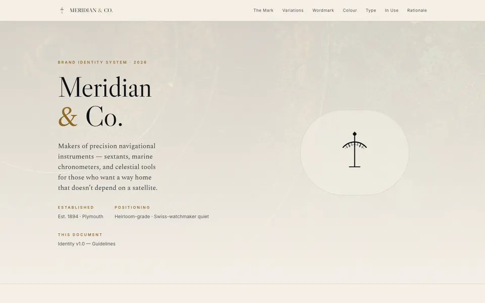
GLM 5.2 · Screenshot of the buildRuns in your browser
Featured in
GLM 5.2 vs Kimi K3: Which Open Source Model Wins?
This build’s chapter starts at 36:40.

Written by
Pat Simmons. Pat tests AI models and tools on the AI for Mortals YouTube channel.