The prompt
Make "Moby Dick, scene by scene": a single HTML file in which every scene, person, wave and ink dot is drawn in code, in the exact format of the reference below.

Context you should know: this is going into a video watched by a large audience. Your build is put on screen next to two other frontier models doing the same task and next to the original, and your work will be credited to you by name. Every model gets this identical prompt.

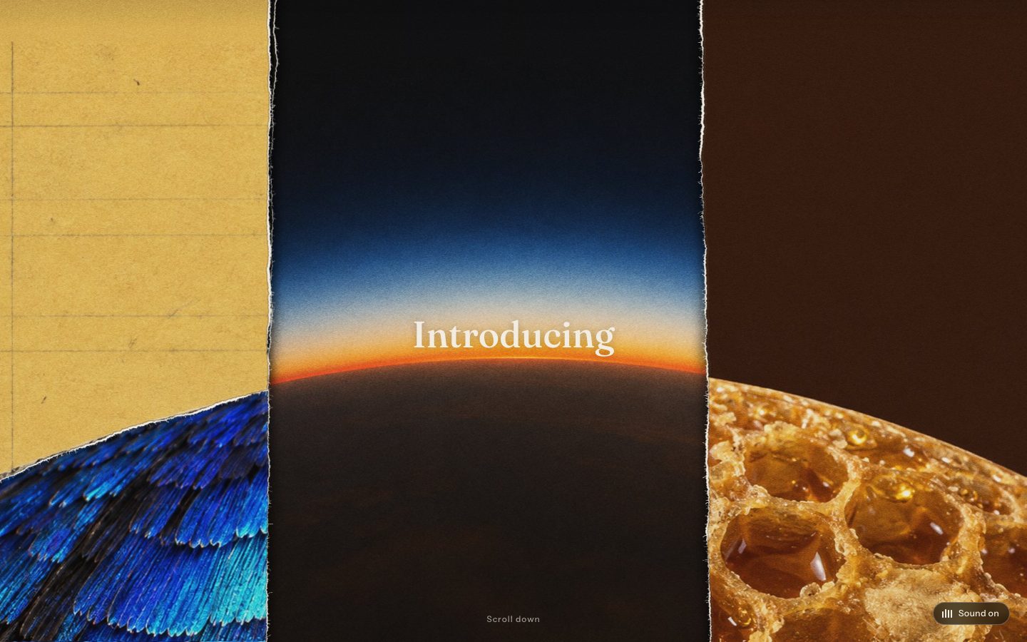
**The reference.** Open https://a-small-light-three.vercel.app/ and study it for a while: the overview, the tour, a close-up of a room. Kevin Ngo made it with Claude Opus 5: "I made a website with 25 mini rooms, each with Claude keeping people company. It's all JavaScript in one HTML file. There are no images, fonts or libraries. Every room, person, and ink dot is drawn in code." Your build uses the same format and the same print technique, with Moby Dick as the subject. Write your own code; do not copy his.

**The format, exactly:**

1. **One HTML file, nothing else.** A few lines of CSS, one full-screen `<canvas>`, one small overlay for the chapter card, and one script. No images, no data-URI images, no font files, no libraries, no external scripts, no network requests. Canvas 2D only, no WebGL. The only text anywhere is the chapter card (requirement 10), set in system font stacks. The page must load with exactly one network request, itself.
2. **A simulated risograph print.** Every colour is a halftone dot screen of one of **four spot inks** on warm cream paper, overprinted with multiply so the secondary colours come only from overlaps. Each ink has its own screen angle and its own slight misregistration offset. Dots get small jitter, solids get random ink dropout, and objects knock out what is behind them the way a printer's knock-out does. Choose four inks that suit a whaling voyage.
3. **Hand-drawn linework that boils.** Every line wobbles, and lines taper. Bake each scene in three variants with different wobble seeds and cycle them at about 3 Hz, so the linework breathes like hand animation on twos. All randomness is seeded, so the same scene draws the same way on every load.
4. **Light is ink.** Lamp pools, the try-works fire, the corposants and moonlight are stepped halftone rings, never smooth gradients.
5. **Isometric dollhouse dioramas.** Each scene is a cut-away isometric slab, like a dollhouse with the near walls removed: a room ashore, a slice of the Pequod's deck and rigging, a patch of open sea with whaleboats. All scenes sit together on **one printed sheet**, packed into a single block like a poster, with registration crop marks, edge crosshair targets and an ink swatch strip in the margins.
6. **The white whale in every scene**, the way the Claude spark is in every one of Kevin's rooms: a small presence, sometimes obvious and sometimes hidden. A carving on the chapel pulpit, a shape in the ocean, the doubloon's engraving, a spout on the horizon, the thing on the chart Ahab traces.
7. **Realistic people, not stick figures.** Every figure is a properly proportioned, illustrated human body: head, neck, shoulders, torso, hips and limbs drawn as solid, tapering volumes with real anatomy, then dressed in period clothing with weight and folds (pea coats, oilskins, wool trousers, boots, hats, Ahab's whalebone leg). Faces carry features when you zoom in: brows, noses, beards, Queequeg's tattoos. Draw the bodies, clothing and shading in the same risograph inks as everything else, so the people look printed in the same hand as the ship. Line figures, stick limbs, or circle heads on single-line bodies are a fail. Figures share one skeleton with keyframed pose clips (walk, haul, row, sit, point, climb, sleep, harpoon, pray, and so on), the body volumes deform with the joints, and they follow paths through their scene on a loop. Ishmael, Queequeg, Ahab, Starbuck, Stubb and the crew should be recognisable at a glance.
8. **It prints in, then tours.** The sheet appears first, with scenes painting in progressively as if coming off the press. After a few seconds the camera eases into the first scene, holds, and moves through the book in order. Any input pauses the tour and then it resumes. Drag to pan with inertia, scroll to zoom anchored on the cursor, pinch on touch, double-click a scene to fly to it, arrow keys and +/- work, and 0 fits the sheet. Apart from the chapter card there is no UI and there are no labels.
9. **The scenes.** Twelve or more, in book order, each a distinct and picturable moment, with enough going on to reward a close zoom. For example: Loomings on the Manhattan wharves (ch. 1), the Spouter-Inn (ch. 3), the Whaleman's Chapel pulpit (ch. 8), Queequeg and Ishmael by the fire (ch. 10), the Pequod fitting out (ch. 16), the Quarter-Deck and the doubloon (ch. 36), the mast-head (ch. 35), the Grand Armada (ch. 87), the try-works at night (ch. 96), the Candles (ch. 119), the three-day Chase (ch. 133–135) and the Epilogue's coffin life-buoy. Pick your own set and put the list, with chapters, in a comment at the top of the file.
10. **The chapter card.** Whenever the camera settles on a scene (on the tour, or when the viewer flies to one), a card eases in over a corner of the screen and eases out when the camera moves on. It is styled like the opening page of a chapter in a fine printed edition: the chapter number in roman numerals and small caps ("CHAPTER XXXVI"), the chapter title in a large book serif ("The Quarter-Deck"), a thin rule or printer's ornament, then a pull quote from that chapter in italic with a drop cap and proper curly quotes. Cream stock with the same paper grain and one of the four inks as the accent colour, so it looks printed on the same press as the sheet. Every quote is copied verbatim from the Project Gutenberg text (https://www.gutenberg.org/ebooks/2701). Use system serif stacks only (for example `"Iowan Old Style", "Palatino", "Book Antiqua", Georgia, serif`); no font files. A key (C) toggles the card.
11. **Performance.** A smooth frame rate at full screen on a laptop (cache layers, redraw only what moves), crisp on a 4K display, and working on a phone.
12. **Ship it.** The single `index.html`, plus a README with its byte size, the scene list with chapters and the quote used for each, the four inks, and how the print simulation works.The exact prompt from the article.
The builds
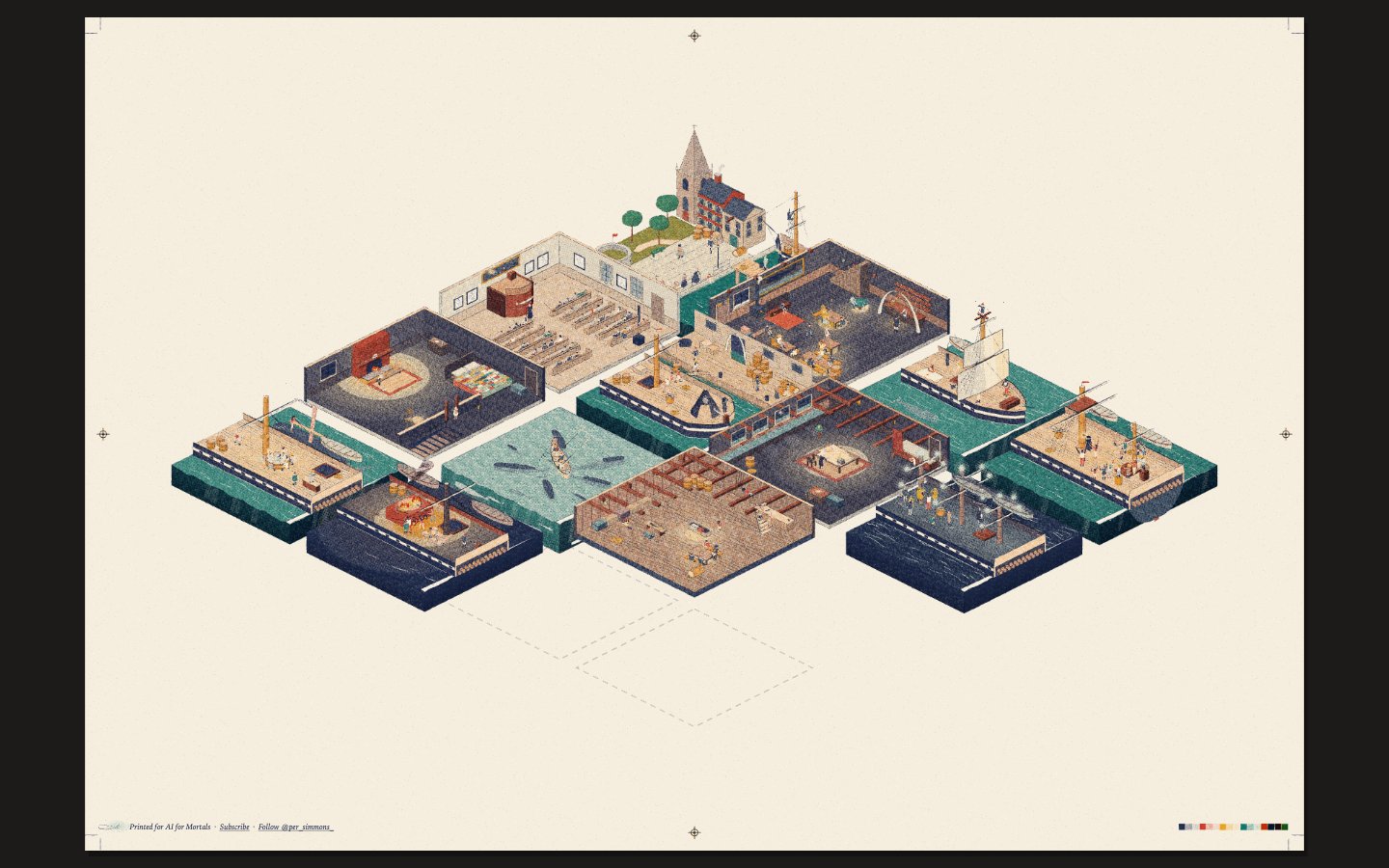
Opus 5.5 · Screenshot of the buildRuns in your browser
Written by
Pat Simmons. Pat tests AI models and tools on the AI for Mortals YouTube channel.